
We’ve all heard the saying, “Don’t judge a book by its cover,” but let’s be honest, we often do! (I must admit, I also pick wines by their labels, but we’ll save that for another time.) For authors, creating a book cover isn’t always straightforward; in fact, it usually isn’t.
I want to take you behind the scenes of one of my recent book design projects for Moe Carrick, who wanted to republish her book “Bravespace Workplace,” initially published in 2019, but with rewritten content and a fresh new cover. Since the original publishing house was no longer around, she decided to self-publish and also changed the title to “When Work is Good.” I immediately loved the new title as it sparked a world of design possibilities.
I embarked on a creative journey, experimenting with various drafts. I began with bold colors, stuck to Moe’s brand colors, and ventured into bolder colors again. The title, “Making Work Good,” brought images of thumbs-up signs, hearts, and joyful interactions among people. However, using images of people required sensitivity to diversity, and symbols like the thumbs-up had to be carefully considered due to cultural differences.
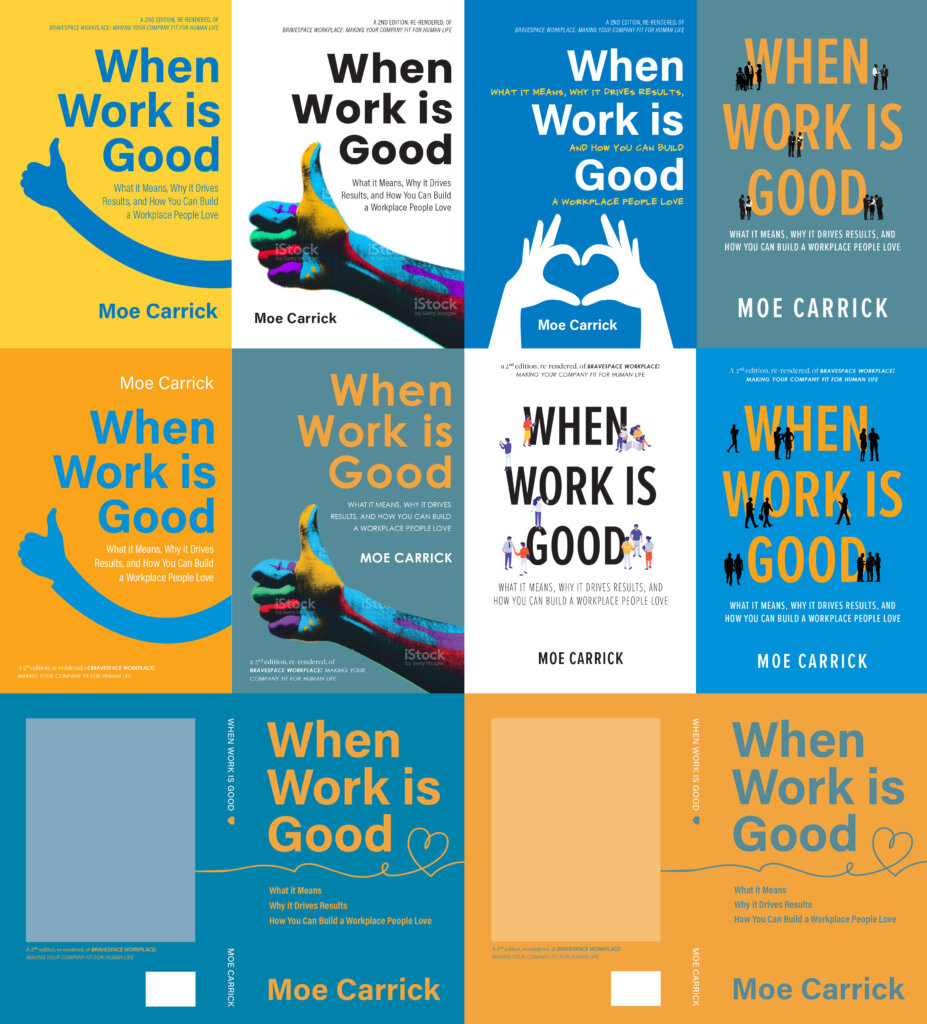
After numerous drafts and back-and-forth emails, we finally settled on a bold, simple, and to-the-point design. It stands out and captures the essence of the book. It wasn’t an easy path, but in the end, both Moe and I were delighted with the result.
Moe’s response: “I love it!!”
In the wise words of design legend Milton Glaser, “There are three responses to a piece of design – yes, no, and WOW! Wow is the one to aim for.” We’re thrilled to have achieved that “wow” factor with Moe’s book cover. It’s a testament to the power of creativity and collaboration. If you’re curious about the final result, see the unveiling of the proof copy here
In the meantime, “When Work is Good” graces the shelves and screens of readers everywhere, making a positive impact and leaving a lasting impression.